

About That Bear Market In Russia
This has easily been one of my favorite assets to hate on throughout 2014. Everything we look at continues to suggest that lower prices are coming, particularly from a structural perspective. Sure, we got a nice bounce this Spring and into early summer, but moves like that are a characteristic of structural declines, not bull markets. After peaking in 2011, Russia has not participated in any of the strength in equities that we’ve seen elsewhere around the world. In fact, the Market Vectors Russia Exchange Traded Fund is down over 50% since the top in 2011 while the S&P500 is up over 50% during that same timeframe. This is just a good example as to why we look at markets around the world. There are good ones to buy and bad ones to sell. Russia has been in the “bad ones” category for a while, and continues to be (see here for more).
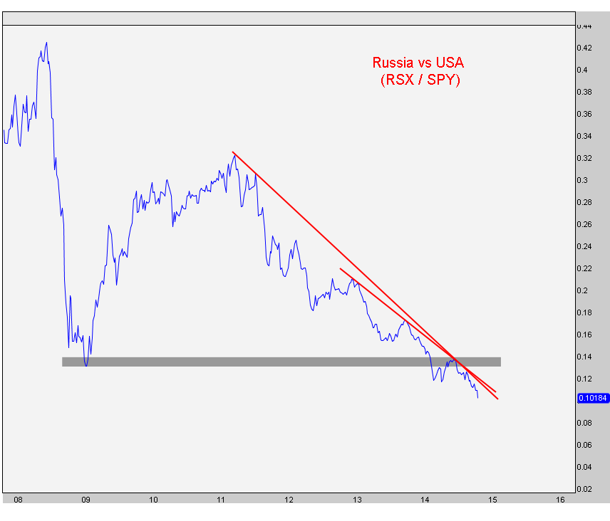
The first chart we’re looking at is a relative strength chart comparing Russia to the United States. This is where we generally like to begin our analysis to figure out where the strength is globally and where the weakness is. It’s not hard to see that Russia is, and has been, in a terrible downtrend:
Now looking at Russia on its own, here is a weekly candlestick chart showing prices selling off every time they hit the downtrend line from the 2008 highs. In addition, we have a downward sloping 200-week moving average and prices now breaking the lows from earlier this year. A big warning sign was that in the most recent counter-trend rally that ended this summer, prices failed to get back up to that downtrend line. This market is so weak that it couldn’t even manage that:
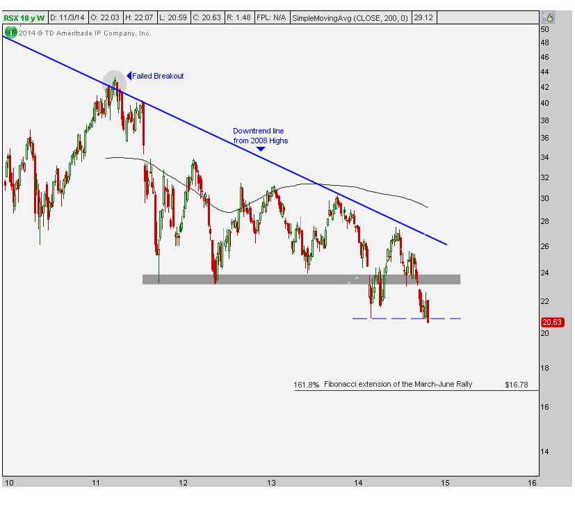
After breaking that key support shaded in gray that goes back to 2011, prices are now trying to take out the lows from earlier this year. Anything below that key level (blue dashed line) and aggressive shorts make the most sense to me. Above those lows and neutral like we have been is likely best. I like my charts clean, and this is one of the cleaner ones around the world. Gold and Silver have been very clean charts as well, for example.
Target-wise I’m still eying that Fibonacci extension from the March-June rally this year. Just under 17 we have a 161.8% extension from the most recent counter-trend rally. I think that’s where we’re headed. If prices are back above the 2014 lows, all bets are off. But below that, and this seems like a risk/reward opportunity that still favors the bears and also in the direction of the underlying trend, which cannot be argued is, and has been, down.
***
Members of Eagle Bay Solutions have been receiving reports every week explaining these bearish characteristics and receive updates weekly as new information comes into the market. Make sure you’ve registered and are receiving this report in your inbox. Members also get additional timeframes and variables including momentum and relative strength on over 80 charts around the world.
Recent free content from J.C. Parets
-
 Emerging Markets Are Still A Problem
— 9/28/15
Emerging Markets Are Still A Problem
— 9/28/15
-
U.S. Stocks Hit 10-Year Highs vs Emerging Markets
— 8/06/15
-
Was That A Failed Breakout in China ?
— 2/04/15
-
The Nifty 50 Hits All-time Highs, Now What?
— 1/21/15
-
 BNN Appearance: Crude Oil, Home Builders, and Bonds
— 1/12/15
BNN Appearance: Crude Oil, Home Builders, and Bonds
— 1/12/15
-
{[comment.author.username]} {[comment.author.username]} — Marketfy Staff — Maven — Member

- 1 Campus Martius, Suite #200Detroit, MI 48226
- +1 877 440 9464