

About That Breakout In The New York Stock Exchange Composite
When I first begin my analysis to figure out how we want to position our portfolio for investors, I prefer to incorporate a top/down approach. What I mean by that, is I like to look at the entire world, International Stock Market Averages and US Indexes as well. Then I work my way down to individual countries and sectors within those Indexes. Then I decide whether I want to be in that particular sector as a group or if there are a name or two within that space that I want to be in specifically. So if I like Semi’s, do I want to own $SMH or something like $MU? That’s my top/down approach.
Today, I’d like to focus on the US Averages. Of all of them, the New York Stock Exchange Composite has been the worst performer from, particularly a bird’s eye view. While the S&P500, Dow Jones Industrial Average, Dow Jones Transportation Average, Russell2000, Mid-cap400 and Nasdaq100 are all well above the former 2007 all-time highs, the NYSE Composite is barely above that prior peak. However, I think it’s finally time for The Composite of all composites to play catch-up.
First, let’s remember what we’re looking at. The NYSE Composite has over 2000 listed components including ADRs and REITs. The majority of these are US companies but about 1/4 are foreign listings. It’s a cap-weighted index, so a lot of the biggest components are actually foreign stocks, which we need to keep in mind, and most likely why it’s been such an underperforming Index.
Here’s what I see. We’re looking at a daily candlestick chart of the NYSE Composite Index going back to its peak last July. We are now bumping up against this overhead supply for the 4th time. I say it all the time: the more times that a level is tested, the higher the likelihood that it breaks. I think this breakout happens soon.
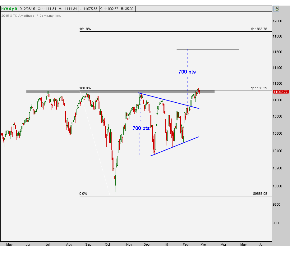
Now I want to turn our attention to the move 2 weeks ago on February 12th. This big green candle was an upside resolution to a symmetrical triangle well-defined by these two converging trendlines since the 4th quarter. Based on the 700-point size of the base, this gives us a measured move target north of 11,600. I think we get there quickly and bigger picture still have upside targets above 11,800 based on the 161.8% Fibonacci extension from the last correction in October.
As long as we are above these former highs since last summer, it is awfully difficult to be bearish towards stocks from an intermediate-term perspective. I think a breakout above this overhead supply could be a very powerful catalyst for, not just US equities, but stocks around the world..
I’d keep this chart nearby.
***
Click Here for more information on our Premium Technical Research Packages
Recent free content from J.C. Parets
-
 Here’s Way I think Rates Are Heading Lower
— 11/12/15
Here’s Way I think Rates Are Heading Lower
— 11/12/15
-
Support & Resistance 101: Apple Edition
— 11/10/15
-
 Video: Technical Analysis Webinar by JC Parets
— 10/01/15
Video: Technical Analysis Webinar by JC Parets
— 10/01/15
-
Find Your Edge: The Autumn 2015 AlphaShark Trading Symposium with a Presentation by J.C. Parets
— 9/25/15
-
Can Financials Correct 30% From Their Highs?
— 9/24/15