

S&P 500 Seasonal Studies Combined
We very fortunate to have many tools at our disposal as market technicians. One of the ones that I find the most value in is seasonality. During different times of the year, the market tends to behave in certain ways. These trends date back to the late 1800s. But in addition to the one-year seasonal pattern, the market behaves in different ways during the 4-year presidential cycle as well as the 10-year decennial pattern which plots how markets perform during different years in a decade. We are currently in the 4th year of this decade (2014), the 2nd year of the presidential cycle (mid-term election) and now entering the best 3 month period of the one-year seasonal cycle (November-January).
Today we are looking at a combination of all three of these patterns in something that we like to call the S&P500 Daily Cumulative Composite. We take each of the three cycles and give it exactly a one-third weighting and then smooth it out. This is what our model looks like for 2014 and suggests strength heading into year end:
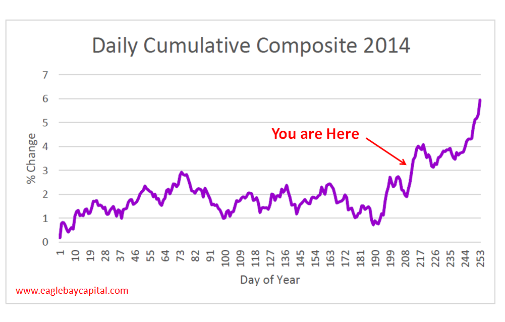
Remember that these seasonal patterns are just a road map. They are one data point among many things that we look at. People are often confused about seasonality and think that you should just buy or sell blindly based on what the market is “supposed” to do (e.g. Sell in May and Go Away). I would argue that the most valuable way to use seasonality is when markets ignore seasonal trends. For example, when markets are supposed to do well during a specific time of the year and struggle instead, the market is telling us that there are larger, more bearish forces at work. At the end of 2007 the US stock market struggled and sold off between November and January, which is supposed to be the most bullish time of the year. What happened after that? One of the greatest crashes in stock market history.
Seasonal trends being ignored was one warning that there was more trouble ahead. I can sit here forever pointing to other such examples. So we’ll take our composite and use it as a road map. It helped us become more market neutral at the end of the summer which helped us tremendously (see here). So let’s remember to use it as just one tool, considering only price pays, but remembering that things should do well into year end.
Members of Eagle Bay Solutions will receive updates on these charts regularly as well as commentary on multiple time frames. These annotated charts include relative strength studies, momentum analysis, fibonacci projections, support and resistance, pattern recognition and risk management procedures. Make sure to sign up here and receive our reports on a weekly basis.
Recent free content from J.C. Parets
-
 Miami This Week For The Finance Festival
— 11/04/15
Miami This Week For The Finance Festival
— 11/04/15
-
The Nasdaq Flirts With All-Time Highs
— 11/02/15
-
 Video: Technical Analysis Webinar by JC Parets
— 9/29/15
Video: Technical Analysis Webinar by JC Parets
— 9/29/15
-
Overhead Supply in Healthcare & Biotech
— 9/22/15
-
Thinking Out Loud Heading Into Q4
— 9/22/15
-
{[comment.author.username]} {[comment.author.username]} — Marketfy Staff — Maven — Member

- 1 Campus Martius, Suite #200Detroit, MI 48226
- +1 877 440 9464