

The Best Recession Ever!
I'm not sure who I borrowed the title of this week's missive from, but I think we all have to admit that this is probably the best recession/slowdown ever!
Instead of the economy flirting with negative growth in the first quarter, which, if you will recall, had become the common expectation as the calendar was flipping from 2018 to 2019, we learned Friday that Q1 GDP came in well above expectations at 3.2%. This despite the now long-forgotten government shutdown subtracting approximately 0.3% from the total. Wow, talk about a surprise to the upside.
Instead of the U.S. succumbing to what has become a widely recognized global slowdown, which for the record, appears to be, at the very least, entering a bottoming phase, our economy put in the best first quarter in four years.
Instead of the much ballyhooed "earnings recession" that so many have been calling for in Q1, Corporate America appears to be doing what it does best - make money. Oh, and according to CNBC, 77% of S&P 500 companies reporting so far have beaten earnings estimates and 56% have exceeded analysts' expectations on the revenue side.
Yes, the earnings season is still young and the current "beat rates" are a far cry from some of the recent earnings parades, that can only be described as gangbusters. But given that the current beat rates are said to be largely in line with historical norms, investors will take this kind of a slowdown any day of the week.
Instead of the stock market fretting about the recession and the earnings decline that everyone was calling for a couple months back, both the NASDAQ and the S&P 500 hit fresh new all-time highs last week. This has left the bears frustrated and wondering what the heck happened to that "retest" that everyone was so sure of back in January and February.
Speaking of our furry friends, the folks wearing their bear caps are quick to point out that Friday's GDP report wasn't all lollipops and rainbows. No, it turns out that the consumer spending and capex (business capital expenditures) components of the GDP report were surprisingly weak. For example, personal consumption expenditures (aka the all-important PCE) posted a 1.2% annual gain, which is a punk number to say the least, and the weakest reading in a year.
On the business front, capex rose at a 2.7% annual rate, which, according to Ned Davis Research, was half the pace of the previous quarter.
Oh, and residential investment actually fell at a 2.8% rate, which marks the fifth consecutive decline.
Stocks Up. Bond Yields Down. Wait, what?
The above referenced batch of weaker-than expected data from the GDP report likely was responsible for the drop in 10-year T-Note yields. I know what you are thinking; how can stocks go up and yields go down on the same report?
The answer is simple. Different strokes for different folks/traders.
Headline GDP growth (which could always be adjusted in the next two months) supports the idea that the good 'ol USofA is NOT at risk of recession anytime soon. And with the Fed, the ECB, China, and the BOJ all talking nice these days, stock market investors can look ahead to brighter days. Days without the threats of a hostile Fed and/or inflation.
Yet, at the same time, the bears are right to a degree as some of the data was definitely not lollipops and rainbows. Thus, yields fell as bond traders focused on the narrative that consumer spending is heading the wrong direction (a result of the government shutdown and Mueller turmoil, perhaps?) and capex wasn't great.
Goldilocks Lives
But from my seat, the important storyline here is it appears Friday's report can be placed in the Goldilocks category. As in not too hot to cause the Fed to change course (again). And not cold enough to create consternation about a recession on the horizon. Nope, this report was "just right" if you are looking ahead to sustained economic growth and an ongoing stream of corporate profits.
Some argue that this is not a "Party On Wayne" situation. Or is it? The S&P finished at an all-time high after the report. Inflation is not a concern. Rates remain low. The economy is growing better than expected. Earnings appear to be doing just fine, thank you. The current rally is hated by many and skeptics about the future abound (which is a good thing from an investing sentiment perspective). And I can argue that consumer spending will perk back up now that the government shutdown is a fading memory and the Mueller report is finally out. All good, right?
Yes, yes, I do understand that stocks are overbought and that the current pace of advance is unsustainable. I recognize that the "sell in May and go away" period begins next week. And I will certainly agree that a pullback of some form is due at some point soon.
However, the bottom line is as long as money needs to be "positioned" in stocks (See my review of Marko Kolanovic's work on the subject here) the dips will likely continue to be bought and those waiting for the so-far elusive pullback will continue to be disappointed.
No, trees don't grow to the sky. And a garden-variety pullback is to be expected. I'm simply saying if there is still a big batch of money that needs to be invested, the current "buy the dip - ANY dip" environment could persist.
And as far as slowdowns go, I too will take this one every time.
Weekly Market Model Review
Now let's turn to the weekly review of my favorite indicators and market models...
The State of the Big-Picture Market Models
I like to start each week with a review of the state of my favorite big-picture market models, which are designed to help me determine which team is in control of the primary trend.
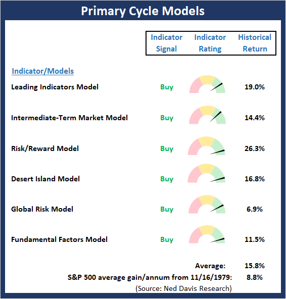
View My Favorite Market Models Online
The Bottom Line:
- The Primary Cycle board upticked again this week as my Intermediate-Term Market Model finally gave up the ghost on overbought concerns and flipped to positive. The message from this board is clear: Investors should stay seated on the bull train.
This week's mean percentage score of my 6 favorite models advanced to 84.7% from 74.6% last week (Prior readings: 58.0%, 49.5%, 47%, 50%, 47.9%, 45.4%) while the median improved to 86.7% from 81.8% last week (Prior readings: 65.9%, 50%, 50%, 50%, 50%, 46.3%).
The State of the Trend
Once I've reviewed the big picture, I then turn to the "state of the trend." These indicators are designed to give us a feel for the overall health of the current short- and intermediate-term trend models.
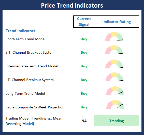
View Trend Indicator Board Online
The Bottom Line:
- For the fourth consecutive week, the Price Trend board scored a perfect 10.0 reading. This isn't exactly surprising given the fresh move to all-time highs for the S&P 500 and the NASDAQ last week. But given that the "Sell in May and go away" period is fast approaching, stocks are overbought, and confirmation among the major indices is lacking, a great many analysts/pundits are growing worried about the next, inevitable pullback. As some sloppy action would not be surprising at some point soon.
The State of Internal Momentum
Next up are the momentum indicators, which are designed to tell us whether there is any "oomph" behind the current trend.
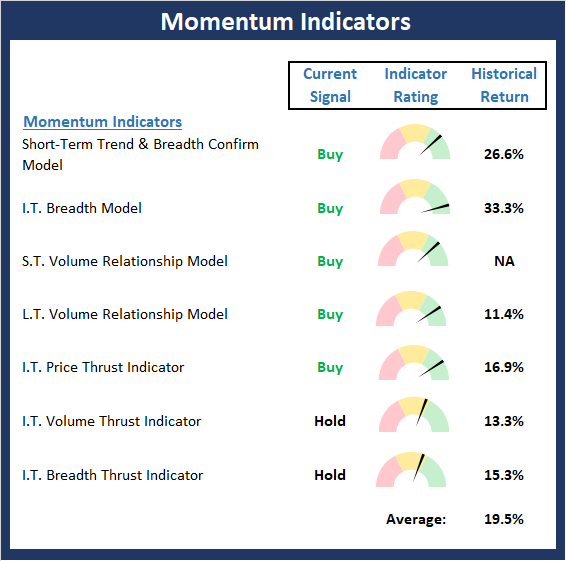
View Momentum Indicator Board Online
The Bottom Line:
- The Momentum board remains in good shape. And while it may be a mistake to fret too much about indicators not being as positive as I'd like to see at this stage, the volume relationship indicators continue to give me pause. My take is that the slow and steady repositioning into equities by hedge funds and systematic traders is to blame here. But the less than stellar readings here is something to watch going forward.
The State of the "Trade"
We also focus each week on the "early warning" board, which is designed to indicate when traders might start to "go the other way" -- for a trade.
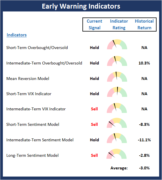
View Early Warning Indicator Board Online
The Bottom Line:
- The message from the Early Warning board is simple: The board continues to wave a yellow flag warning of the potential for some kind of pullback/corrective action.
The State of the Macro Picture
Now let's move on to the market's fundamental factors - the indicators designed to tell us the state of the big-picture market drivers including monetary conditions, the economy, inflation, and valuations.
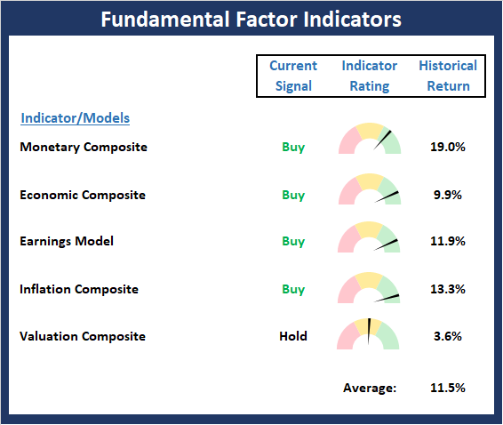
View Fundamental Indicator Board Online
The Bottom Line:
- The Fundamentals board, which usually is slow to change, saw modest improvement again last week. We got some additional improvement in the economic and monetary models, and one of the component indicators in our valuation composite also upticked . As I've been saying, the Fundamental board continues to favor the bulls.
Thought For The Day:
The real voyage of discovery consists not in seeking new lands but seeing with new eyes. - Marcel Proust
Wishing you green screens and all the best for a great day,

David D. Moenning
Founder, Chief Investment Officer
Heritage Capital Research
HCR Focuses on a Risk-Managed Approach to Investing
What Risk Management Can and Cannot Do

HCR Awarded Top Honors in 2018 NAAIM Shark Tank Portfolio Strategy Competition
Each year, NAAIM (National Association of Active Investment Managers) hosts a competition to identify the best actively managed investment strategies. In April, HCR's Dave Moenning took home first place for his flagship risk management strategy.
<hr>Disclosures
At the time of publication, Mr. Moenning held long positions in the following securities mentioned: None - Note that positions may change at any time.
Leading Indicators Model: A group of indicators that have historically shown tendencies to lead the market at major turning points.
Intermediate-Term Market Model: A composite model (model of models) focused on trend and momentum indicators which has been designed to provide identify intermediate-term trading opportunities.
Risk/Reward Model: A model-of-models intended to provide an overall view of the state of the risk/reward environment. The model includes tape, monetary, and sentiment indicators as well as 7 big-picture market model readings.
Desert Island Model: If I was stranded on a desert island with access to only one market model to manage money with, this would be the model. The model is a comprehensive model-of-models comprised of trend, momentum, mean reversion, economic, monetary, sentiment, and factor-based indicators/models.
External Factors Model: A model-of-models designed to provide a reading on the "macro state" of the market environment. The model is comprised of indicators/models in the areas of various index yields, industrial production, investors sentiment, and historic volatility.
Short-Term Trend-and-Breadth Signal Explained: History shows the most reliable market moves tend to occur when the breadth indices are in gear with the major market averages. When the breadth measures diverge, investors should take note that a trend reversal may be at hand. This indicator incorporates NDR's All-Cap Dollar Weighted Equity Series and A/D Line. From 1998, when the A/D line is above its 5-day smoothing and the All-Cap Equal Weighted Equity Series is above its 25-day smoothing, the equity index has gained at a rate of +32.5% per year. When one of the indicators is above its smoothing, the equity index has gained at a rate of +13.3% per year. And when both are below, the equity index has lost +23.6% per year.
Channel Breakout System Explained: The short-term and intermediate-term Channel Breakout Systems are modified versions of the Donchian Channel indicator. According to Wikipedia, "The Donchian channel is an indicator used in market trading developed by Richard Donchian. It is formed by taking the highest high and the lowest low of the last n periods. The area between the high and the low is the channel for the period chosen."
Intermediate-Term Trend-and-Breadth Signal Explained: This indicator incorporates NDR's All-Cap Dollar Weighted Equity Series and A/D Line. From 1998, when the A/D line is above its 45-day smoothing and the All-Cap Equal Weighted Equity Series is above its 45-day smoothing, the equity index has gained at a rate of +17.6% per year. When one of the indicators is above its smoothing, the equity index has gained at a rate of +6.5% per year. And when both are below, the equity index has lost -1.3% per year.
Cycle Composite Projections: The cycle composite combines the 1-year Seasonal, 4-year Presidential, and 10-year Decennial cycles. The indicator reading shown uses the cycle projection for the upcoming week.
Trading Mode Indicator: This indicator attempts to identify whether the current trading environment is "trending" or "mean reverting." The indicator takes the composite reading of the Efficiency Ratio, the Average Correlation Coefficient, and Trend Strength models.
Volume Relationship Models: These models review the relationship between "supply" and "demand" volume over the short- and intermediate-term time frames.
Price Thrust Model Explained: This indicator measures the 3-day rate of change of the Value Line Composite relative to the standard deviation of the 30-day average. When the Value Line's 3-day rate of change have moved above 0.5 standard deviation of the 30-day average ROC, a "thrust" occurs and since 2000, the Value Line Composite has gained ground at a rate of +20.6% per year. When the indicator is below 0.5 standard deviation of the 30-day, the Value Line has lost ground at a rate of -10.0% per year. And when neutral, the Value Line has gained at a rate of +5.9% per year.
Volume Thrust Model Explained: This indicator uses NASDAQ volume data to indicate bullish and bearish conditions for the NASDAQ Composite Index. The indicator plots the ratio of the 10-day total of NASDAQ daily advancing volume (i.e., the total volume traded in stocks which rose in price each day) to the 10-day total of daily declining volume (volume traded in stocks which fell each day). This ratio indicates when advancing stocks are attracting the majority of the volume (readings above 1.0) and when declining stocks are seeing the heaviest trading (readings below 1.0). This indicator thus supports the case that a rising market supported by heavier volume in the advancing issues tends to be the most bullish condition, while a declining market with downside volume dominating confirms bearish conditions. When in a positive mode, the NASDAQ Composite has gained at a rate of +38.3% per year, When neutral, the NASDAQ has gained at a rate of +13.3% per year. And when negative, the NASDAQ has lost at a rate of -14.279% per year.
Breadth Thrust Model Explained: This indicator uses the number of NASDAQ-listed stocks advancing and declining to indicate bullish or bearish breadth conditions for the NASDAQ Composite. The indicator plots the ratio of the 10-day total of the number of stocks rising on the NASDAQ each day to the 10-day total of the number of stocks declining each day. Using 10-day totals smooths the random daily fluctuations and gives indications on an intermediate-term basis. As expected, the NASDAQ Composite performs much better when the 10-day A/D ratio is high (strong breadth) and worse when the indicator is in its lower mode (weak breadth). The most bullish conditions for the NASDAQ when the 10-day A/D indicator is not only high, but has recently posted an extreme high reading and thus indicated a thrust of upside momentum. Bearish conditions are confirmed when the indicator is low and has recently signaled a downside breadth thrust. In positive mode, the NASDAQ has gained at a rate of +22.1% per year since 1981. In a neutral mode, the NASDAQ has gained at a rate of +14.5% per year. And when in a negative mode, the NASDAQ has lost at a rate of -6.4% per year.
Short-Term Overbought/sold Indicator: This indicator is the current reading of the 14,1,3 stochastic oscillator. When the oscillator is above 80 and the %K is above the %D, the indicator gives an overbought reading. Conversely, when the oscillator is below 20 and %K is below its %D, the indicator is oversold.
Intermediate-Term Overbought/sold Indicator: This indicator is a 40-day RSI reading. When above 57.5, the indicator is considered overbought and wnen below 45 it is oversold.
Mean Reversion Model: This is a diffusion model consisting of five indicators that can produce buy and sell signals based on overbought/sold conditions.
VIX Indicator: This indicators looks at the current reading of the VIX relative to standard deviation bands. When the indicator reaches an extreme reading in either direction, it is an indication that a market trend could reverse in the near-term.
Short-Term Sentiment Indicator: This is a model-of-models composed of 18 independent sentiment indicators designed to indicate when market sentiment has reached an extreme from a short-term perspective. Historical analysis indicates that the stock market's best gains come after an environment has become extremely negative from a sentiment standpoint. Conversely, when sentiment becomes extremely positive, market returns have been subpar.
Intermediate-Term Sentiment Indicator: This is a model-of-models composed of 7 independent sentiment indicators designed to indicate when market sentiment has reached an extreme from a intrmediate-term perspective. Historical analysis indicates that the stock market's best gains come after an environment has become extremely negative from a sentiment standpoint. Conversely, when sentiment becomes extremely positive, market returns have been subpar.
Long-Term Sentiment Indicator: This is a model-of-models composed of 6 independent sentiment indicators designed to indicate when market sentiment has reached an extreme from a long-term perspective. Historical analysis indicates that the stock market's best gains come after an environment has become extremely negative from a sentiment standpoint. Conversely, when sentiment becomes extremely positive, market returns have been subpar.
Absolute Monetary Model Explained: The popular cliche, "Don't fight the Fed" is really a testament to the profound impact that interest rates and Fed policy have on the market. It is a proven fact that monetary conditions are one of the most powerful influences on the direction of stock prices. The Absolute Monetary Model looks at the current level of interest rates relative to historical levels and Fed policy.
Relative Monetary Model Explained: The "relative" monetary model looks at monetary indicators relative to recent levels as well as rates of change and Fed Policy.
Economic Model Explained: During the middle of bull and bear markets, understanding the overall health of the economy and how it impacts the stock market is one of the few truly logical aspects of the stock market. When our Economic model sports a "positive" reading, history (beginning in 1965) shows that stocks enjoy returns in excess of 21% per year. Yet, when the model's reading falls into the "negative" zone, the S&P has lost nearly -25% per year. However, it is vital to understand that there are times when good economic news is actually bad for stocks and vice versa. Thus, the Economic model can help investors stay in tune with where we are in the overall economic cycle.
Inflation Model Explained: They say that "the tape tells all." However, one of the best "big picture" indicators of what the market is expected to do next is inflation. Simply put, since 1962, when the model indicates that inflationary pressures are strong, stocks have lost ground. Yet, when inflationary pressures are low, the S&P 500 has gained ground at a rate in excess of 13%. The bottom line is inflation is one of the primary drivers of stock market returns.
Valuation Model Explained: If you want to get analysts really riled up, you need only to begin a discussion of market valuation. While the question of whether stocks are overvalued or undervalued appears to be a simple one, the subject is actually extremely complex. To simplify the subject dramatically, investors must first determine if they should focus on relative valuation (which include the current level of interest rates) or absolute valuation measures (the more traditional readings of Price/Earnings, Price/Dividend, and Price/Book Value). We believe that it is important to recognize that environments change. And as such, the market's focus and corresponding view of valuations are likely to change as well. Thus, we depend on our Valuation Models to help us keep our eye on the ball.
<hr>Disclosures
The opinions and forecasts expressed herein are those of Mr. David Moenning and may not actually come to pass. Mr. Moenning's opinions and viewpoints regarding the future of the markets should not be construed as recommendations. The analysis and information in this report is for informational purposes only. No part of the material presented in this report is intended as an investment recommendation or investment advice. Neither the information nor any opinion expressed constitutes a solicitation to purchase or sell securities or any investment program.
Any investment decisions must in all cases be made by the reader or by his or her investment adviser. Do NOT ever purchase any security without doing sufficient research. There is no guarantee that the investment objectives outlined will actually come to pass. All opinions expressed herein are subject to change without notice. Neither the editor, employees, nor any of their affiliates shall have any liability for any loss sustained by anyone who has relied on the information provided.
Mr. Moenning may at times have positions in the securities referred to and may make purchases or sales of these securities while publications are in circulation. Positions may change at any time.
The analysis provided is based on both technical and fundamental research and is provided "as is" without warranty of any kind, either expressed or implied. Although the information contained is derived from sources which are believed to be reliable, they cannot be guaranteed.
Investments in equities carry an inherent element of risk including the potential for significant loss of principal. Past performance is not an indication of future results.
Recent free content from FrontRange Trading Co.
-
 Is The Bull Argument Too Easy These Days?
— 8/31/20
Is The Bull Argument Too Easy These Days?
— 8/31/20
-
What Do The Cycles Say About 2020?
— 1/21/20
-
Modeling 2020 Expectations (Just For Fun)
— 1/13/20
-
Tips From Real-World Wendy Rhoades
— 5/06/19
-
Is "Melt-Up" The Operative Word?
— 4/22/19
