

Was That A Failed Breakout in China ?
One of the things that we want to do this year is to try and provide more free content for our readers. This blog has been a place for me to share ideas and put thoughts down on paper for almost 4 years now. People from all over the world come this site daily and I am always getting amazing emails from readers with comments, questions, thank you’s, and genuine interest in my work. That really means a lot to me and I want to make sure that we stay true to what this blog was initially intended for: to share ideas.
Last year we launched a subscription research arm to Eagle Bay Capital that we named Eagle Bay Solutions. These weekly reports are literally the homework that I do for our Hedge Fund. The only way to find the best risk/reward opportunities is to put in the work, look through all of the charts, annotate them and write bullish, bearish or neutral comments. I do this selfishly to find what I think are the best trades in the world. So far this service is growing every day and we have received incredible feedback from subscribers. I wish I had done this earlier, but obviously this is easier said that done. We put in a lot of time and energy to make sure this would be a great product for our members. That doesn’t happen overnight. But so far well worth the effort.
We have 5 reports that we put out weekly: Global Equities, US Averages & Interest Rates, Commodities & Currencies, Dow 30 and US Sectors & Sub-sectors. You can click on each of these to learn more about them. Each report includes every ticker on both weekly and daily timeframes, momentum readings, relative strength, Fibonacci projections and most importantly detailed risk management procedures. What we’re going to start doing is that on occasion I will share one chart from each report that stands out to me. Maybe not the most bullish or most bearish one, but a chart that I find intriguing. Sometimes I won’t have much conviction, and perhaps even asking a question.
I just finished up our Global Macro report that consists of 88 charts from countries all over the world. Members of Eagle Bay Solutions will receive it over the weekend. One that stands out to me is China $FXI. Here we are looking at them on two timeframes. The first is the weekly chart. What I want to point out is specifically the action this month. Notice the breakout above overhead supply going back to late 2012. This is marked by a dashed blue line. This week prices rolled over hard and confirmed a bearish momentum divergence as we can see plotted below price.
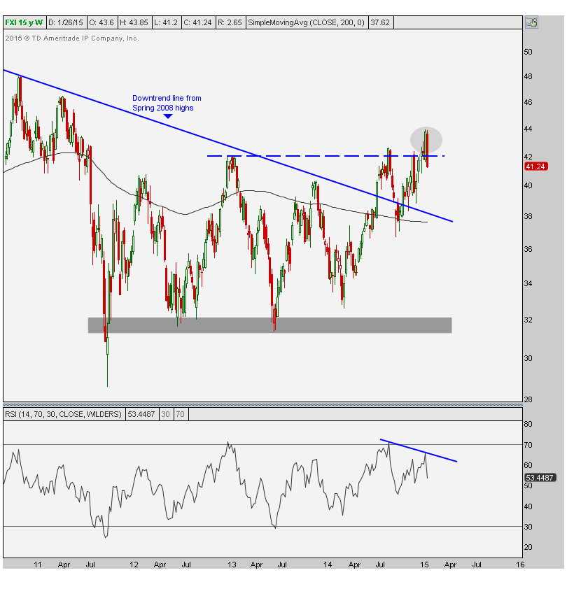
From failed moves come fast ones in the opposite direction. This one has “failed breakout” written all over it and only a recovery rally back above the September highs would invalidate these bearish developments. Here is a daily chart to give you guys a closer look at what just occurred. Prices were able to break out on the 3rd test of this overhead supply since September, which as we can see on the weekly chart goes back to 2012. After the initial breakout two weeks ago, prices melted all this week and are now back below all of this overhead supply. Not good:
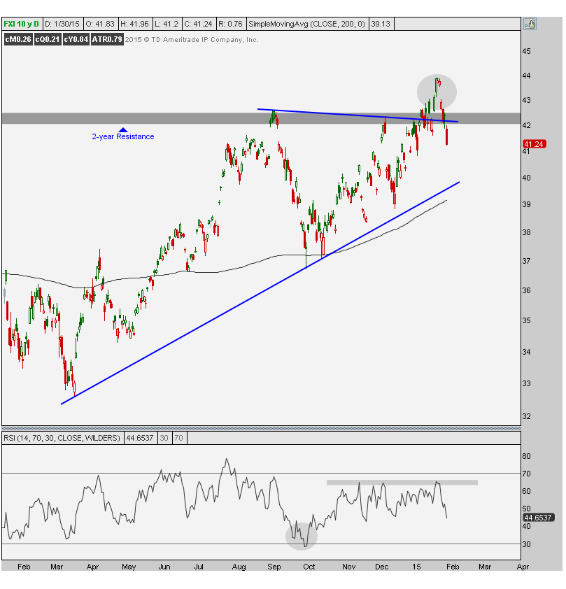
Momentum never hit overbought readings on this rally confirming the bearish developments that momentum is giving us on the weekly timeframe. Both the weekly and daily charts are suggesting that heavy selling could be coming in this market. I would not be long this name if we are below this overhead supply and would actually rather be on the short side until price can prove that it is able to stay above this resitance.
***
Click Here to gain access to the rest of the 86 charts from all over the world.
Recent free content from J.C. Parets
-
{[comment.author.username]} {[comment.author.username]} — Marketfy Staff — Maven — Member

- 1 Campus Martius, Suite #200Detroit, MI 48226
- +1 877 440 9464