

All Clear?
The bad news is that after a rather rambunctious rally, the S&P 500 remains -8.9% from its all-time high. The good news is that after the -19.8% shellacking that ended on Christmas Eve, the stock market now starts the week well above its December lows and looking good.
To be sure, the recent rally has been impressive. In the last 17 trading sessions, the venerable S&P 500 has gained an eye-popping +13.6%. In the last 17 days, the index has finished in the red just 4 times and save the second trading day of 2019, the damage done during those losing sessions has been minimal. In the last 17 days, the major indices have "exited corrections," recouped their respective 50-day moving averages, and produced what are commonly referred to as "thrust" buy-signals. And in the last 17 days, the mood has turned from dismal to delight.
Suddenly, stocks don't go down anymore - ever. The trend is up. Momentum is strong. And anyone looking to add to their long exposure has been frustrated by the fact that there just aren't any "dips" to buy these days.
Thus, the major question on my mind as we start this holiday-shortened week is, are the bulls in the clear?
Long-time readers know that I refer to "thrust" buy-signals as a sign that the market's outlook is indeed "all clear" if one has a 6 to 12-month time horizon. In short, these indicators are designed to tell us when buying overwhelms selling over a 10-day period, which has historically been a bullish omen. As in, it's safe to buy again.
For example, when the ratio of 10-day advancing issues to declining issues exceeds 1.9 to 1, a "breadth thrust" buy signal is given. This particular indicator has been "right" (meaning the market has moved higher after the signal) 42 out of the 48 times since 1947 the signal has been given and would have produced an average gain of 10.5% in the ensuing 6 months and 16.5% a year after from the signal - both of which are about double the historical means of 4.26% and 8.79% respectively (source Ned Davis Research).
Oh, and this indicator flashed a fresh buy signal on January 9th.
Another such "thrust" indicator looks at the "oomph" behind market movements. Specifically, what is called a "deviation from trend" indicator looks for the market to move 2.25 standard deviations above its 225-day moving average - which is certainly no easy feat. According to the computers at Ned Davis Research, this is something that has only happened 15 times since 1980, with the most recent signal occurring on January 11, 2019.
Based on history, the signal would have been "right" 13 of the last 14 occurrences over the ensuing 6- and 12-month periods. The only losing signal 6-months after the signal was seen happened in 2002 and the only "wrong" signal a year on was back in 1987.
Other than that, the signals have been pretty darn good with some of the best coming in October 2002, March 2009, and March 2, 2016. On average, the S&P 500 would have gained 12.6% in the 6-months after a signal (versus the average for all 6-month periods of 4.72%) and 18.4% a year after the signal (versus 9.87% for all 12-month periods during the time frame tested).
In addition, one of my favorite long-term "state of the market" signals - which measures the "technical health" of the S&P's 150+ sub-industry groups - flashed a new buy signal last week. While the "timing" of the signals from this indicator aren't always great from a short-term perspective, history shows that when the majority of the market's sub-industries are in good shape from a trend standpoint, the stock market tends to produce above-average returns.
So, the bottom line here is for anyone with a longer-term time horizon (6-12 months), these signals provide reasons to be optimistic about the future.
The Shorter-Term Outlook Has Issues To Contend With
But... (You knew that was coming, didn't you?)... It is also important to recognize that everything isn't completely rosy from a near-term perspective and that after the recent joyride to the upside, some sloppy action might be in order.
Exhibit A in my argument here would be the fact that stocks are overbought from a near-term perspective and are quickly approaching such a state from an intermediate-term view. This is not a reason to be bearish, mind you, but rather a reason to look for the bears to return to the game at some point soon.
Lest we forget, the "Crash Playbook" tells us that the stock market tends to "retest" the "emotional/panic lows" once the "dead-cat bounce" has run its course. And with the help of a little hindsight, it is now clear that Christmas Eve marked the "emotional/panic low" and that what we are seeing currently could very well be termed a "dead-cat bounce."
Yes, there have been times in history where the so-called retest was either hard to see or nonexistent (aka a "V" bottom). However, the vast majority of times that stocks got hit as hard as they did during the fourth quarter of 2018, the original reason for the decline tends rears its ugly head a time or two in the ensuing 3 months.
A Couple Reasons For Caution Here
In addition, there a couple more reasons that some caution may still be warranted in the coming weeks/months. First up is my "Primary Cycle" indicators board. Scroll down to the first set of indicators posted below. A quick glance should make it clear that there is still a lot of red on the board. In fact, not one of my favorite, long-term market models designed to tell us which team has control of the ball is currently positive. Hmmm...
No, the lack of positive readings on this board does not mean that stocks are bound to head lower from here. It simply suggests that all is not right (yet) with the indicator world and that some caution remains warranted. You know, just in case any of the original reasons for the -19.8% drubbing rears its ugly head again soon.
On that note, recall that #GrowthSlowing was one of the big-3 drivers of the bearish dance to the downside seen from October through December. The bulls argue that the other two problems (the worries over a "Fed Overshoot" and the trade war dragging the global economy down) have been - or are expected to be - "handled." However, the annoying little issue of a slowdown in both economic and earnings growth should be respected as the source of at least a potential problem again at some point.
For example, over the weekend, we first got word that China's official growth rate for 2018 was the slowest in 28 years. In addition, the IMF cut their forecast for global growth - again. And then there is the earnings parade here in the U.S. to consider, which is by no means complete.
While it is true that earnings season is off to what is being referred to as a "good start" - largely because bank earnings weren't as bad as folks had feared - the meat of the season is yet to come. So, call me a Nervous Nellie if you must, but I would prefer to see the reports from the big boys and her their thoughts on the outlook for business going forward before throwing to the wind, backing up the truck, and buying with both hands.
So, getting back to the question at hand, are the bulls in the clear? The answer is most likely, yes - IF one has the proper time frame. However, given the issues still at hand, there just may be a struggle or two to deal with in the near-term.
Weekly Market Model Review
Now let's turn to the weekly review of my favorite indicators and market models...
The State of the Big-Picture Market Models
I like to start each week with a review of the state of my favorite big-picture market models, which are designed to help me determine which team is in control of the primary trend.
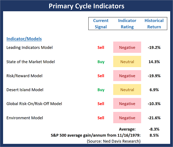
View My Favorite Market Models Online
The Bottom Line:
- My apologies for sounding like a broken record, but for the third week in a row, there is an important change on the Primary Cycle board. Unfortunately, this week's change is to the downside. While stocks are enjoying a robust rally, the Risk/Reward model slipped back into negative territory and flashed a buy signal. And although the rally is young, I would feel a lot more comfortable if a couple more of my favorite models would move to the buy side and if some of the indicator ratings would turn green.
This week's mean percentage score of my 6 favorite models fell to 41.9% from 46.1% (2 weeks ago: 40.3%, 3 weeks ago: 36.5%, 4 weeks ago: 41.9%) while the median declined to 40.0% from 55.0% (2 weeks ago: 50.0%, 3 weeks ago: 44.0%, 4 weeks ago: 44.2%).
The State of the Trend
Once I've reviewed the big picture, I then turn to the "state of the trend." These indicators are designed to give us a feel for the overall health of the current short- and intermediate-term trend models.

View Trend Indicator Board Online
The Bottom Line:
- There can be little argument that after an impressive pop to the upside, the state of the stock market's trend has improved. In fact, both the short- and intermediate-term trend models are now rated as positive. However, the long-term picture still has a fair amount of work to do before turning green and the historical cycles point down for the coming week (before returning to the upside for the following two weeks).
The State of Internal Momentum
Next up are the momentum indicators, which are designed to tell us whether there is any "oomph" behind the current trend.
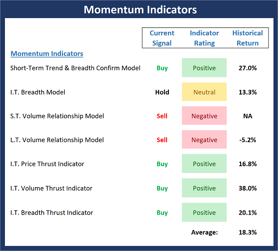
View Momentum Indicator Board Online
The Bottom Line:
- While not all indicators on the Momentum board are not positive (yet?), it is worth noting that all have improved substantially over the last 3 weeks. For example, while the Intermediate-term Breadth, Short- and Long-term Volume Relationship models are not green here, all three are within shouting distance of buy signals and positive readings.
The State of the "Trade"
We also focus each week on the "early warning" board, which is designed to indicate when traders might start to "go the other way" -- for a trade.
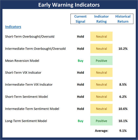
View Early Warning Indicator Board Online
The Bottom Line:
- Stocks are currently overbought from a short-term perspective and almost any decline will trigger a sell signal from our s.t. overbought/sold model. In addition, investor sentiment, which had recently reached the "it's so bad that it's good" zone, is no longer a tailwind for the bulls. The bottom line here is stocks are ripe for a pullback.
The State of the Macro Picture
Now let's move on to the market's "environmental factors" - the indicators designed to tell us the state of the big-picture market drivers including monetary conditions, the economy, inflation, and valuations.
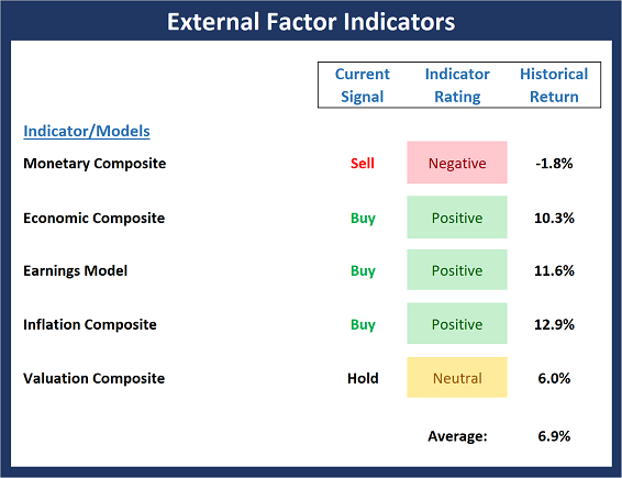
View Environment Indicator Board Online
The Bottom Line:
- Although the major stock indices continued to power ahead last week, our External Factors board, which looks at the fundamental drivers of stock prices, experienced a setback as the Monetary Composite slipped back into the negative zone. Overall, the board remains in pretty good shape. However, if the bulls are thinking about a new leg higher in an ongoing secular bull cycle, I'd like to see more green here.
Thought For The Day:
Only those who dare to fail greatly can ever achieve greatly. - Robert F. Kennedy
Wishing you green screens and all the best for a great day,

David D. Moenning
Founder, Chief Investment Officer
Heritage Capital Research
HCR Focuses on a Risk-Managed Approach to Investing
What Risk Management Can and Cannot Do

HCR Awarded Top Honors in 2018 NAAIM Shark Tank Portfolio Strategy Competition
Each year, NAAIM (National Association of Active Investment Managers) hosts a competition to identify the best actively managed investment strategies. In April, HCR's Dave Moenning took home first place for his flagship risk management strategy.
<hr>Disclosures
At the time of publication, Mr. Moenning held long positions in the following securities mentioned: None - Note that positions may change at any time.
Indicators Explained
Short-Term Trend-and-Breadth Signal Explained: History shows the most reliable market moves tend to occur when the breadth indices are in gear with the major market averages. When the breadth measures diverge, investors should take note that a trend reversal may be at hand. This indicator incorporates NDR's All-Cap Dollar Weighted Equity Series and A/D Line. From 1998, when the A/D line is above its 5-day smoothing and the All-Cap Equal Weighted Equity Series is above its 25-day smoothing, the equity index has gained at a rate of +32.5% per year. When one of the indicators is above its smoothing, the equity index has gained at a rate of +13.3% per year. And when both are below, the equity index has lost +23.6% per year.
Channel Breakout System Explained: The short-term and intermediate-term Channel Breakout Systems are modified versions of the Donchian Channel indicator. According to Wikipedia, "The Donchian channel is an indicator used in market trading developed by Richard Donchian. It is formed by taking the highest high and the lowest low of the last n periods. The area between the high and the low is the channel for the period chosen."
Intermediate-Term Trend-and-Breadth Signal Explained: This indicator incorporates NDR's All-Cap Dollar Weighted Equity Series and A/D Line. From 1998, when the A/D line is above its 45-day smoothing and the All-Cap Equal Weighted Equity Series is above its 45-day smoothing, the equity index has gained at a rate of +17.6% per year. When one of the indicators is above its smoothing, the equity index has gained at a rate of +6.5% per year. And when both are below, the equity index has lost -1.3% per year.
Cycle Composite Projections: The cycle composite combines the 1-year Seasonal, 4-year Presidential, and 10-year Decennial cycles. The indicator reading shown uses the cycle projection for the upcoming week.
Trading Mode Indicator: This indicator attempts to identify whether the current trading environment is "trending" or "mean reverting." The indicator takes the composite reading of the Efficiency Ratio, the Average Correlation Coefficient, and Trend Strength models.
Volume Relationship Models: These models review the relationship between "supply" and "demand" volume over the short- and intermediate-term time frames.
Price Thrust Model Explained: This indicator measures the 3-day rate of change of the Value Line Composite relative to the standard deviation of the 30-day average. When the Value Line's 3-day rate of change have moved above 0.5 standard deviation of the 30-day average ROC, a "thrust" occurs and since 2000, the Value Line Composite has gained ground at a rate of +20.6% per year. When the indicator is below 0.5 standard deviation of the 30-day, the Value Line has lost ground at a rate of -10.0% per year. And when neutral, the Value Line has gained at a rate of +5.9% per year.
Volume Thrust Model Explained: This indicator uses NASDAQ volume data to indicate bullish and bearish conditions for the NASDAQ Composite Index. The indicator plots the ratio of the 10-day total of NASDAQ daily advancing volume (i.e., the total volume traded in stocks which rose in price each day) to the 10-day total of daily declining volume (volume traded in stocks which fell each day). This ratio indicates when advancing stocks are attracting the majority of the volume (readings above 1.0) and when declining stocks are seeing the heaviest trading (readings below 1.0). This indicator thus supports the case that a rising market supported by heavier volume in the advancing issues tends to be the most bullish condition, while a declining market with downside volume dominating confirms bearish conditions. When in a positive mode, the NASDAQ Composite has gained at a rate of +38.3% per year, When neutral, the NASDAQ has gained at a rate of +13.3% per year. And when negative, the NASDAQ has lost at a rate of -12.29% per year.
Breadth Thrust Model Explained: This indicator uses the number of NASDAQ-listed stocks advancing and declining to indicate bullish or bearish breadth conditions for the NASDAQ Composite. The indicator plots the ratio of the 10-day total of the number of stocks rising on the NASDAQ each day to the 10-day total of the number of stocks declining each day. Using 10-day totals smooths the random daily fluctuations and gives indications on an intermediate-term basis. As expected, the NASDAQ Composite performs much better when the 10-day A/D ratio is high (strong breadth) and worse when the indicator is in its lower mode (weak breadth). The most bullish conditions for the NASDAQ when the 10-day A/D indicator is not only high, but has recently posted an extreme high reading and thus indicated a thrust of upside momentum. Bearish conditions are confirmed when the indicator is low and has recently signaled a downside breadth thrust. In positive mode, the NASDAQ has gained at a rate of +22.1% per year since 1981. In a neutral mode, the NASDAQ has gained at a rate of +14.5% per year. And when in a negative mode, the NASDAQ has lost at a rate of -6.4% per year.
Short-Term Overbought/sold Indicator: This indicator is the current reading of the 14,1,3 stochastic oscillator. When the oscillator is above 80 and the %K is above the %D, the indicator gives an overbought reading. Conversely, when the oscillator is below 20 and %K is below its %D, the indicator is oversold.
Intermediate-Term Overbought/sold Indicator: This indicator is a 40-day RSI reading. When above 57.5, the indicator is considered overbought and when below 45 it is oversold.
Mean Reversion Model: This is a diffusion model consisting of five indicators that can produce buy and sell signals based on overbought/sold conditions.
VIX Indicator: This indicator looks at the current reading of the VIX relative to standard deviation bands. When the indicator reaches an extreme reading in either direction, it is an indication that a market trend could reverse in the near-term.
Short-Term Sentiment Indicator: This is a model-of-models composed of 18 independent sentiment indicators designed to indicate when market sentiment has reached an extreme from a short-term perspective. Historical analysis indicates that the stock market's best gains come after an environment has become extremely negative from a sentiment standpoint. Conversely, when sentiment becomes extremely positive, market returns have been subpar.
Intermediate-Term Sentiment Indicator: This is a model-of-models composed of 7 independent sentiment indicators designed to indicate when market sentiment has reached an extreme from an intermediate-term perspective. Historical analysis indicates that the stock market's best gains come after an environment has become extremely negative from a sentiment standpoint. Conversely, when sentiment becomes extremely positive, market returns have been subpar.
Long-Term Sentiment Indicator: This is a model-of-models composed of 6 independent sentiment indicators designed to indicate when market sentiment has reached an extreme from a long-term perspective. Historical analysis indicates that the stock market's best gains come after an environment has become extremely negative from a sentiment standpoint. Conversely, when sentiment becomes extremely positive, market returns have been subpar.
Absolute Monetary Model Explained: The popular cliché, "Don't fight the Fed" is really a testament to the profound impact that interest rates and Fed policy have on the market. It is a proven fact that monetary conditions are one of the most powerful influences on the direction of stock prices. The Absolute Monetary Model looks at the current level of interest rates relative to historical levels and Fed policy.
Relative Monetary Model Explained: The "relative" monetary model looks at monetary indicators relative to recent levels as well as rates of change and Fed Policy.
Economic Model Explained: During the middle of bull and bear markets, understanding the overall health of the economy and how it impacts the stock market is one of the few truly logical aspects of the stock market. When our Economic model sports a "positive" reading, history (beginning in 1965) shows that stocks enjoy returns in excess of 21% per year. Yet, when the model's reading falls into the "negative" zone, the S&P has lost nearly -25% per year. However, it is vital to understand that there are times when good economic news is actually bad for stocks and vice versa. Thus, the Economic model can help investors stay in tune with where we are in the overall economic cycle.
Inflation Model Explained: They say that "the tape tells all." However, one of the best "big picture" indicators of what the market is expected to do next is inflation. Simply put, since 1962, when the model indicates that inflationary pressures are strong, stocks have lost ground. Yet, when inflationary pressures are low, the S&P 500 has gained ground at a rate in excess of 13%. The bottom line is inflation is one of the primary drivers of stock market returns.
Valuation Model Explained: If you want to get analysts really riled up, you need only to begin a discussion of market valuation. While the question of whether stocks are overvalued or undervalued appears to be a simple one, the subject is extremely complex. To simplify the subject dramatically, investors must first determine if they should focus on relative valuation (which include the current level of interest rates) or absolute valuation measures (the more traditional readings of Price/Earnings, Price/Dividend, and Price/Book Value). We believe that it is important to recognize that environments change. And as such, the market's focus and corresponding view of valuations are likely to change as well. Thus, we depend on our Valuation Models to help us keep our eye on the ball.
<hr>Disclosures
The opinions and forecasts expressed herein are those of Mr. David Moenning and may not actually come to pass. Mr. Moenning's opinions and viewpoints regarding the future of the markets should not be construed as recommendations. The analysis and information in this report is for informational purposes only. No part of the material presented in this report is intended as an investment recommendation or investment advice. Neither the information nor any opinion expressed constitutes a solicitation to purchase or sell securities or any investment program.
Any investment decisions must in all cases be made by the reader or by his or her investment adviser. Do NOT ever purchase any security without doing sufficient research. There is no guarantee that the investment objectives outlined will actually come to pass. All opinions expressed herein are subject to change without notice. Neither the editor, employees, nor any of their affiliates shall have any liability for any loss sustained by anyone who has relied on the information provided.
Mr. Moenning may at times have positions in the securities referred to and may make purchases or sales of these securities while publications are in circulation. Positions may change at any time.
The analysis provided is based on both technical and fundamental research and is provided "as is" without warranty of any kind, either expressed or implied. Although the information contained is derived from sources which are believed to be reliable, they cannot be guaranteed.
Investments in equities carry an inherent element of risk including the potential for significant loss of principal. Past performance is not an indication of future results.
Recent free content from FrontRange Trading Co.
-
 Is The Bull Argument Too Easy These Days?
— 8/31/20
Is The Bull Argument Too Easy These Days?
— 8/31/20
-
What Do The Cycles Say About 2020?
— 1/21/20
-
Modeling 2020 Expectations (Just For Fun)
— 1/13/20
-
Tips From Real-World Wendy Rhoades
— 5/06/19
-
The Best Recession Ever!
— 4/29/19
