

Bull vs. Bear. The Line In The Sand?
On Tuesday, February 5 and again on Wednesday, February 6, the S&P 500 bumped into its 200-day moving average. While I'm not exactly sure why this particular indicator captures the attention of so many (there are a myriad of more effective trend-following tools readily available), the crossing of the 200-day is viewed as a big deal. Some go so far as to say the moving average represents a line in the sand between the bulls and the bears. As in, if the current price of a security or index resides above its 200-day, it is considered a bull market and if below, a bear market.
Personally, I don't subscribe to such a view. However, it is worth noting that a great many investors, including throngs that get paid to invest other people's money, do see the 200-day as a critical line of demarcation. Thus, how the market acts when it approaches its 200-day is viewed as important.
So, what was the market's reaction when the S&P 500 "tested" its 200-day for the first time in 42 days? See for yourself...
S&P 500 - Daily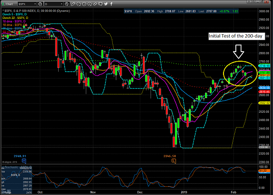
View Large Chart
While I wouldn't call it an abject failure, the index did pull back a bit after flirting with the all-important line in the sand for a couple days. So, the question, of course is what, if any message should we take from the initial "bonk" at the 200-day?
The Bull's View
Always optimistic, those wearing their bull caps last week viewed the action as positive. The words "a pause that refreshes" were bandied about quite a bit in the bull camp. After all, even the most ardent bull will admit that stocks have run a long way in a short period of time, that the indices are overbought, and that sentiment has rebounded quite a bit. As such, a brief respite before the real run for the border begins certainly makes sense.
I'll add that last week's intraday action was pretty darn good. With stocks overbought and bumping into resistance, the bears could have easily grabbed control of the game and proceed scare the bejeebers out of everyone again based on some of the headlines.
If you will recall, there was the declaration that Trump wasn't planning on meeting with China's Xi Jingping before the March 1 tariff deadline (initial positioning?). There were some not-so-hot economic data. And there was word that global growth appears to be slowing more than expected.
It Isn't The News, It's...
But as the saying goes, it isn't the news, it's how the market reacts to the news that is important. And yes, stocks did fall on Thursday and opened lower again on Friday. But given that the market rallied fairly vigorously off the lows on both days, one has to be impressed that the bulls were not run over and actually held their ground rather nicely.
Tape readers tell us that this was "good action" and therefore, we should expect further rally attempts in the coming days.
Backing up their claim from a fundamental perspective, our heroes in horns contend that the current rally reflects a "correction" of December's fear-based selling. The Fed changed its course and promised not to be stubborn. And then on the trade front, everybody expects a deal of some form to get done sooner rather than later. And since the President is known for negotiating via his Twitter account, last week's developments could be ignored.
So, with two of the big three fears out of the way and the current earnings parade being viewed as "not as bad as feared," the bulls argue that it's onward and upward from here.
The Bear's View
As you might suspect, our furry friends have a slightly different take here. Those in the bear camp remind us that a robust bounce off an emotional low is completely normal and that more times than not, the indices tend to revisit or "test" the lows a time or two. Thus, the failure to simply blast through the 200-day suggests that the recent bounce may have run its course.
Those seeing the market's glass as half-empty counter the "good action" argument with the idea that "FOMO" (fear of missing out) and a dip-buying mentality has returned, and that neither is likely to last long.
The reasoning here is the market's third big fear (#GrowthSlowing) has not been "solved." In fact, the problem is getting worse.
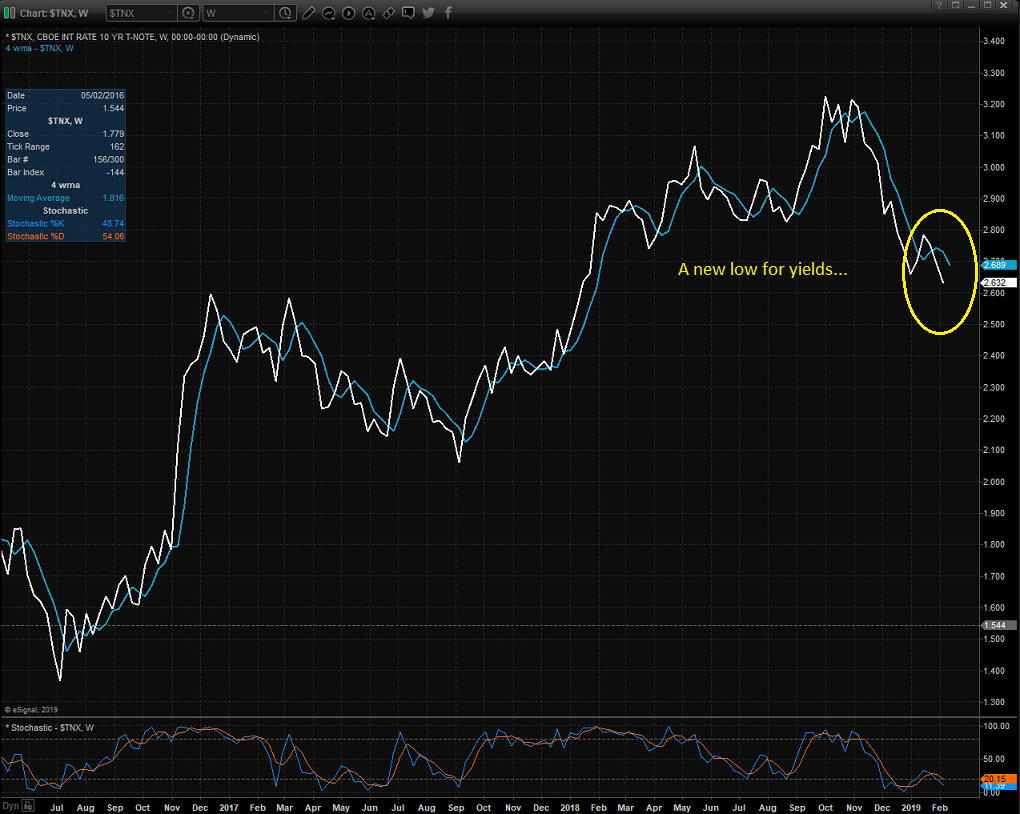
Bond Yields Not Jiving
Exhibit A in the bear camp's argument is the action in the bond market. In short, yields all over the globe are falling. And the U.S. is not exempt as the 10-Year made a new 13-month/cycle low last week.
10 Year T-Note Yield - Weekly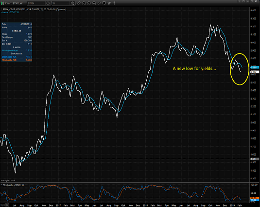
View Large Chart
As the chart above illustrates, the yield on the U.S. 10-Year has fallen from above 3.2% in November to 2.6% last week. Not exactly the type of behavior one might expect during a stock market rally.
Looking around the globe, the trend is the same. The yield on the German Bund has declined to 0.09%, from above 0.50% in October. And Japan's 10-Year yield went negative.
On that note, according to Bloomberg, nearly $9 trillion of global bonds ended the week with negative yields, an amount that is up about 50% since late last year.
The key point is that falling rates don't jive with an "everything is peachy keen" stock market outlook. So, while the stock market appears to be in an optimistic mood, bond traders have a different view.
The problem here is pretty straightforward - global growth continues to slow. For example, the European Commission cut its 2019 GDP estimate by nearly a third last week. The expectation for eurozone GDP growth now stands at 1.3%, down from 1.9%. That was a hefty cut, and a surprise to many.
Next, Italy wins the booby prize for being the first country to officially enter recession. Growth in Germany is faltering due to the slowdown in China. Australia's central bank cut it's outlook for the country's growth. And India's central bank surprised traders by cutting rates last week.
And yet, investors here at home seem to think that the U.S. will be immune to slowing global growth. Hmmm...
Maybe The Fed Caved Because...
At the very least, we may want to consider that Powell's bunch didn't cave to either political or market pressure. No, perhaps the Fed's new "patient" stance is tied to door number three: #GrowthSlowing.
Yes, it is indeed positive that the Fed has said it won't accidentally drag the U.S. into recession by going too far with their rate hikes. And it is also positive that everybody expects a deal to get done with China. From my seat, the argument can be made that ending the trade spat could possibly mark an end to the #GrowthSlowing movement and reinvigorate global economic growth.
Which brings us back to the question at hand. Will stocks break above the 200-day and send an all-clear signal to bullish investors near and far? Or have the bulls used up their lot of good news in getting back to the 200-day?
Time will tell, of course. But, I for one, am going to continue to watch the action in the bond market as a "tell" on the issue of global growth.
Weekly Market Model Review
Now let's turn to the weekly review of my favorite indicators and market models...
The State of the Big-Picture Market Models
I like to start each week with a review of the state of my favorite big-picture market models, which are designed to help me determine which team is in control of the primary trend.

View My Favorite Market Models Online
The Bottom Line:
- While the bulls appear to be in control of the game from a near-term perspective and it is clear that the intraday dips are being bought these days, the status of my Primary Cycle board indicators remains sub-par. This is disconcerting to say the least and I view the message as a warning that this may not be the best time to throw caution to the wind.
This week's mean percentage score of my 6 favorite models held steady at 48.9% versus 48.9% last week (2 weeks ago: 47.8%, 3 weeks ago: 41.9%, 4 weeks ago: 46.1%) while the median also was unchanged at 46.7% from 46.7% last week (2 weeks ago: 45%, 3 weeks ago: 40%, 4 weeks ago: 55%).
The State of the Trend
Once I've reviewed the big picture, I then turn to the "state of the trend." These indicators are designed to give us a feel for the overall health of the current short- and intermediate-term trend models.
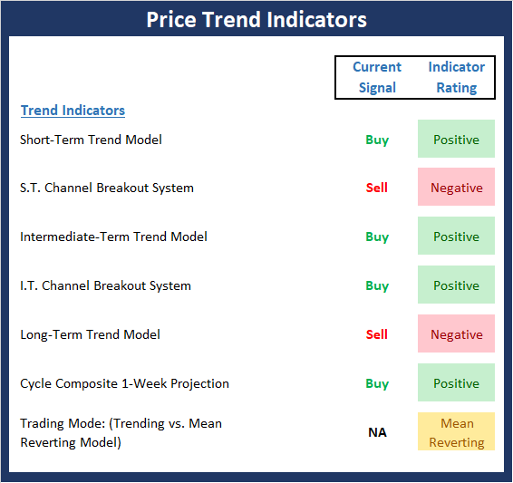
View Trend Indicator Board Online
The Bottom Line:
- After a +16.44% jaunt higher in less than six weeks, a pause in the action was to be expected. The bottom line is the recent rate of ascent was unsustainable. My view is the first four weeks of the blast "corrected" the fear/algo-induced panic that occurred from 12/14-12/24 as the big worry (Fed Overshoot) appears to have been resolved. However, with the market now back to its 200-day moving average and in an overbought condition, the bulls resolve is being tested. The chart action so far has been encouraging and continues to give the bulls the edge in the near-term. But, again, stocks are overbought and a further pullback would not surprise anyone.
The State of Internal Momentum
Next up are the momentum indicators, which are designed to tell us whether there is any "oomph" behind the current trend.
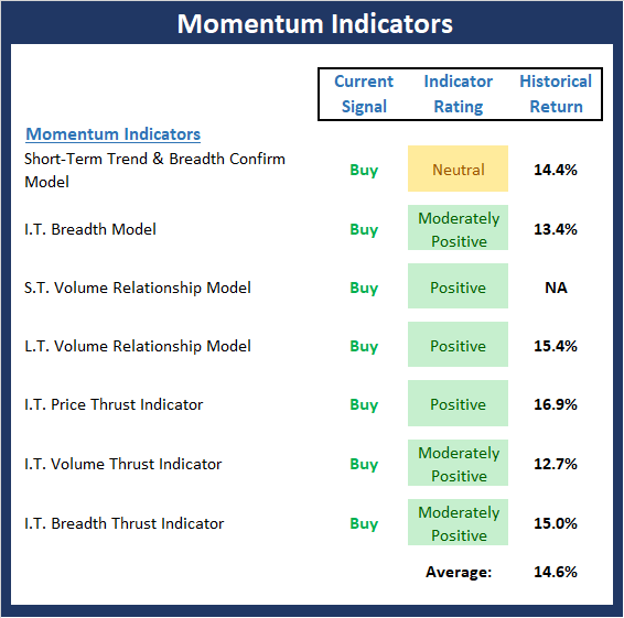
View Momentum Indicator Board Online
The Bottom Line:
- Although there has been some modest deterioration, the primary color emanating from the Momentum board remains green this week. As I mentioned last week, the key takeaway here is the recent momentum thrust buy signals suggest a buy-the-dip environment has returned and that looking back at history, the gains to be expected over the next six- and twelve-month periods are above normal.
The State of the "Trade"
We also focus each week on the "early warning" board, which is designed to indicate when traders might start to "go the other way" -- for a trade.
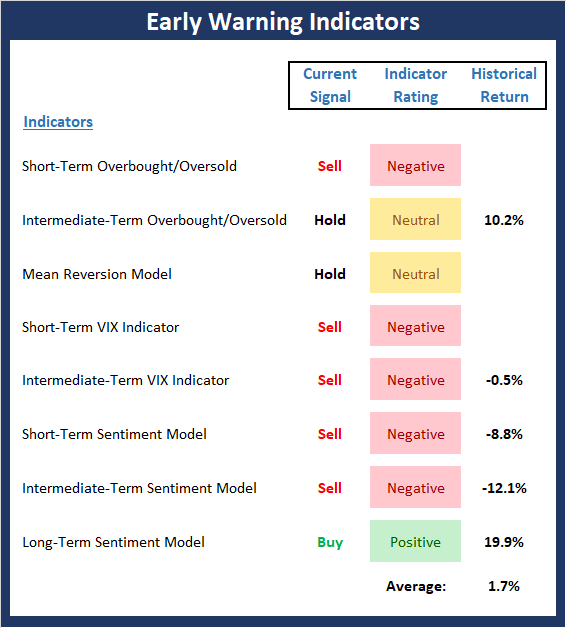
View Early Warning Indicator Board Online
The Bottom Line:
- What a difference a couple of weeks can make on the Early Warning board. That "warm and fuzzy" feeling everyone seems to now have toward the stock market has caused the board to flip from green to red. And while stocks can certainly "get overbought and stay overbought" for extended periods of time, the board is suggesting that a pullback - or, at the very least, a pause that refreshes - continues to be a probable outcome in the near-term.
The State of the Macro Picture
Now let's move on to the market's fundamental factors - the indicators designed to tell us the state of the big-picture market drivers including monetary conditions, the economy, inflation, and valuations.
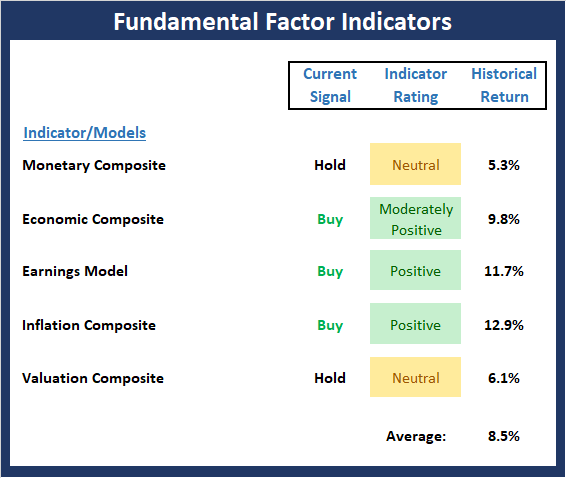
View Fundamental Indicator Board Online
The Bottom Line:
- As I wrote last week, the Fundamental Factors board suggests that the fundamental backdrop for equities remains constructive. However, it is worth noting that there is some weakness starting to creep into the monetary and economic composites. But for now, this board says the bulls should be given the benefit of any doubt.
Thought For The Day:
Great spirits have always encountered violent opposition from mediocre minds. -Albert Einstein
Wishing you green screens and all the best for a great day,

David D. Moenning
Founder, Chief Investment Officer
Heritage Capital Research
HCR Focuses on a Risk-Managed Approach to Investing
What Risk Management Can and Cannot Do

HCR Awarded Top Honors in 2018 NAAIM Shark Tank Portfolio Strategy Competition
Each year, NAAIM (National Association of Active Investment Managers) hosts a competition to identify the best actively managed investment strategies. In April, HCR's Dave Moenning took home first place for his flagship risk management strategy.
<hr>Disclosures
At the time of publication, Mr. Moenning held long positions in the following securities mentioned: None - Note that positions may change at any time.
Indicators Explained
Short-Term Trend-and-Breadth Signal Explained: History shows the most reliable market moves tend to occur when the breadth indices are in gear with the major market averages. When the breadth measures diverge, investors should take note that a trend reversal may be at hand. This indicator incorporates NDR's All-Cap Dollar Weighted Equity Series and A/D Line. From 1998, when the A/D line is above its 5-day smoothing and the All-Cap Equal Weighted Equity Series is above its 25-day smoothing, the equity index has gained at a rate of +32.5% per year. When one of the indicators is above its smoothing, the equity index has gained at a rate of +13.3% per year. And when both are below, the equity index has lost +23.6% per year.
Channel Breakout System Explained: The short-term and intermediate-term Channel Breakout Systems are modified versions of the Donchian Channel indicator. According to Wikipedia, "The Donchian channel is an indicator used in market trading developed by Richard Donchian. It is formed by taking the highest high and the lowest low of the last n periods. The area between the high and the low is the channel for the period chosen."
Intermediate-Term Trend-and-Breadth Signal Explained: This indicator incorporates NDR's All-Cap Dollar Weighted Equity Series and A/D Line. From 1998, when the A/D line is above its 45-day smoothing and the All-Cap Equal Weighted Equity Series is above its 45-day smoothing, the equity index has gained at a rate of +17.6% per year. When one of the indicators is above its smoothing, the equity index has gained at a rate of +6.5% per year. And when both are below, the equity index has lost -1.3% per year.
Cycle Composite Projections: The cycle composite combines the 1-year Seasonal, 4-year Presidential, and 10-year Decennial cycles. The indicator reading shown uses the cycle projection for the upcoming week.
Trading Mode Indicator: This indicator attempts to identify whether the current trading environment is "trending" or "mean reverting." The indicator takes the composite reading of the Efficiency Ratio, the Average Correlation Coefficient, and Trend Strength models.
Volume Relationship Models: These models review the relationship between "supply" and "demand" volume over the short- and intermediate-term time frames.
Price Thrust Model Explained: This indicator measures the 3-day rate of change of the Value Line Composite relative to the standard deviation of the 30-day average. When the Value Line's 3-day rate of change have moved above 0.5 standard deviation of the 30-day average ROC, a "thrust" occurs and since 2000, the Value Line Composite has gained ground at a rate of +20.6% per year. When the indicator is below 0.5 standard deviation of the 30-day, the Value Line has lost ground at a rate of -10.0% per year. And when neutral, the Value Line has gained at a rate of +5.9% per year.
Volume Thrust Model Explained: This indicator uses NASDAQ volume data to indicate bullish and bearish conditions for the NASDAQ Composite Index. The indicator plots the ratio of the 10-day total of NASDAQ daily advancing volume (i.e., the total volume traded in stocks which rose in price each day) to the 10-day total of daily declining volume (volume traded in stocks which fell each day). This ratio indicates when advancing stocks are attracting the majority of the volume (readings above 1.0) and when declining stocks are seeing the heaviest trading (readings below 1.0). This indicator thus supports the case that a rising market supported by heavier volume in the advancing issues tends to be the most bullish condition, while a declining market with downside volume dominating confirms bearish conditions. When in a positive mode, the NASDAQ Composite has gained at a rate of +38.3% per year, When neutral, the NASDAQ has gained at a rate of +13.3% per year. And when negative, the NASDAQ has lost at a rate of -12.99% per year.
Breadth Thrust Model Explained: This indicator uses the number of NASDAQ-listed stocks advancing and declining to indicate bullish or bearish breadth conditions for the NASDAQ Composite. The indicator plots the ratio of the 10-day total of the number of stocks rising on the NASDAQ each day to the 10-day total of the number of stocks declining each day. Using 10-day totals smooths the random daily fluctuations and gives indications on an intermediate-term basis. As expected, the NASDAQ Composite performs much better when the 10-day A/D ratio is high (strong breadth) and worse when the indicator is in its lower mode (weak breadth). The most bullish conditions for the NASDAQ when the 10-day A/D indicator is not only high, but has recently posted an extreme high reading and thus indicated a thrust of upside momentum. Bearish conditions are confirmed when the indicator is low and has recently signaled a downside breadth thrust. In positive mode, the NASDAQ has gained at a rate of +22.1% per year since 1981. In a neutral mode, the NASDAQ has gained at a rate of +14.5% per year. And when in a negative mode, the NASDAQ has lost at a rate of -6.4% per year.
Short-Term Overbought/sold Indicator: This indicator is the current reading of the 14,1,3 stochastic oscillator. When the oscillator is above 80 and the %K is above the %D, the indicator gives an overbought reading. Conversely, when the oscillator is below 20 and %K is below its %D, the indicator is oversold.
Intermediate-Term Overbought/sold Indicator: This indicator is a 40-day RSI reading. When above 57.5, the indicator is considered overbought and when below 45 it is oversold.
Mean Reversion Model: This is a diffusion model consisting of five indicators that can produce buy and sell signals based on overbought/sold conditions.
VIX Indicator: This indicator looks at the current reading of the VIX relative to standard deviation bands. When the indicator reaches an extreme reading in either direction, it is an indication that a market trend could reverse in the near-term.
Short-Term Sentiment Indicator: This is a model-of-models composed of 18 independent sentiment indicators designed to indicate when market sentiment has reached an extreme from a short-term perspective. Historical analysis indicates that the stock market's best gains come after an environment has become extremely negative from a sentiment standpoint. Conversely, when sentiment becomes extremely positive, market returns have been subpar.
Intermediate-Term Sentiment Indicator: This is a model-of-models composed of 7 independent sentiment indicators designed to indicate when market sentiment has reached an extreme from an intermediate-term perspective. Historical analysis indicates that the stock market's best gains come after an environment has become extremely negative from a sentiment standpoint. Conversely, when sentiment becomes extremely positive, market returns have been subpar.
Long-Term Sentiment Indicator: This is a model-of-models composed of 6 independent sentiment indicators designed to indicate when market sentiment has reached an extreme from a long-term perspective. Historical analysis indicates that the stock market's best gains come after an environment has become extremely negative from a sentiment standpoint. Conversely, when sentiment becomes extremely positive, market returns have been subpar.
Absolute Monetary Model Explained: The popular cliché, "Don't fight the Fed" is really a testament to the profound impact that interest rates and Fed policy have on the market. It is a proven fact that monetary conditions are one of the most powerful influences on the direction of stock prices. The Absolute Monetary Model looks at the current level of interest rates relative to historical levels and Fed policy.
Relative Monetary Model Explained: The "relative" monetary model looks at monetary indicators relative to recent levels as well as rates of change and Fed Policy.
Economic Model Explained: During the middle of bull and bear markets, understanding the overall health of the economy and how it impacts the stock market is one of the few truly logical aspects of the stock market. When our Economic model sports a "positive" reading, history (beginning in 1965) shows that stocks enjoy returns in excess of 21% per year. Yet, when the model's reading falls into the "negative" zone, the S&P has lost nearly -25% per year. However, it is vital to understand that there are times when good economic news is actually bad for stocks and vice versa. Thus, the Economic model can help investors stay in tune with where we are in the overall economic cycle.
Inflation Model Explained: They say that "the tape tells all." However, one of the best "big picture" indicators of what the market is expected to do next is inflation. Simply put, since 1962, when the model indicates that inflationary pressures are strong, stocks have lost ground. Yet, when inflationary pressures are low, the S&P 500 has gained ground at a rate in excess of 13%. The bottom line is inflation is one of the primary drivers of stock market returns.
Valuation Model Explained: If you want to get analysts really riled up, you need only to begin a discussion of market valuation. While the question of whether stocks are overvalued or undervalued appears to be a simple one, the subject is extremely complex. To simplify the subject dramatically, investors must first determine if they should focus on relative valuation (which include the current level of interest rates) or absolute valuation measures (the more traditional readings of Price/Earnings, Price/Dividend, and Price/Book Value). We believe that it is important to recognize that environments change. And as such, the market's focus and corresponding view of valuations are likely to change as well. Thus, we depend on our Valuation Models to help us keep our eye on the ball.
<hr>Disclosures
The opinions and forecasts expressed herein are those of Mr. David Moenning and may not actually come to pass. Mr. Moenning's opinions and viewpoints regarding the future of the markets should not be construed as recommendations. The analysis and information in this report is for informational purposes only. No part of the material presented in this report is intended as an investment recommendation or investment advice. Neither the information nor any opinion expressed constitutes a solicitation to purchase or sell securities or any investment program.
Any investment decisions must in all cases be made by the reader or by his or her investment adviser. Do NOT ever purchase any security without doing sufficient research. There is no guarantee that the investment objectives outlined will actually come to pass. All opinions expressed herein are subject to change without notice. Neither the editor, employees, nor any of their affiliates shall have any liability for any loss sustained by anyone who has relied on the information provided.
Mr. Moenning may at times have positions in the securities referred to and may make purchases or sales of these securities while publications are in circulation. Positions may change at any time.
The analysis provided is based on both technical and fundamental research and is provided "as is" without warranty of any kind, either expressed or implied. Although the information contained is derived from sources which are believed to be reliable, they cannot be guaranteed.
Investments in equities carry an inherent element of risk including the potential for significant loss of principal. Past performance is not an indication of future results.
Recent free content from FrontRange Trading Co.
-
 Is The Bull Argument Too Easy These Days?
— 8/31/20
Is The Bull Argument Too Easy These Days?
— 8/31/20
-
What Do The Cycles Say About 2020?
— 1/21/20
-
Modeling 2020 Expectations (Just For Fun)
— 1/13/20
-
Tips From Real-World Wendy Rhoades
— 5/06/19
-
The Best Recession Ever!
— 4/29/19
